#bootstrap sidebar
Explore tagged Tumblr posts
Visit Tumblr Blog
Explore Tumblr blogs with no restrictions, modern design and the best experience.
Last Seen Tumblr Blogs


Fun Fact
1,644 Tumblr posts in 1 second.
Text
it might have taken upwards of 4 hours between yesterday and today, but I finally got toyhouse to give me functional on-hover dropdown menus <3 exciting times!
#.txt#web dev stuff#<- kinda#i got on-click bootstrap dropdowns working Fairly quickly but what I didn't realise#was that you can't use the bootstrap menus with the hover.#most bootstrap hover menus seem to use jquery or javascript and because i'm working Within toyhouse i can't do that#so that made things a little more complicated ;u;#it also made trying to figure out how other people do things VERY complicated. jesus christ. staring into the abyss.#After ALL of this i think i'm gonna make a collection of snippets. just so other people don't have to deal with this fucking bullshit.#like how to move the sidebar and stuff. because i couldn't find any one place for it and it was really frustrating.#the horrors of working within someone else's spaghetti code are very very real and working with classes and containers you didn't make feel#bad.#i don't enjoy it.#but i am nothing if not hell bent on making things more complicated than they need to be <33333 so we persist!!#this is a lot of effort for a site i don't regularly use and never enjoyed using but like. it's a fun exercise i guess
1 note
·
View note
Video
youtube
Create a sidebar with submenu using ReactJS | Devhubspot
0 notes
Text
This episode pointing out how much rich white people don’t fuck with poor white people, and Firecracker just not getting it. They prefer Sister Sage’s company to yours. You can’t pull yourself up by your bootstraps. That’s a lie they told you so when you realized how much they despised you, you’d try and do exactly that to gain their approval. The perfect little foot soldier.
And Sister Sage; “humans are animals”. Well yes, you’re the smartest person in the world, you should know that. I’m going to assume you’re calling humans subhuman - does that include your grandmother? You know how rich white men are and that’s who you went to with your idea. That’s also who you continue to toil in service to. If you were truly the smartest person in the world, you should be able to devise a way of getting around them to solve the world’s issues. You’re very intelligent but you’re also a coward. And you’ve become just like the ppl you hate; which you know. Sidebar: Did you have no community growing up? If humans are animals then what does that make you; the experiment created by said animals.
Also, Ryan. You smiling a lil too much for me. We’re seeing in real time how they break down and indoctrinate children.
Victoria: Yes, the US is not a democracy and never has been. It’s that very sad state of affairs which has made you and everyone around you so miserable. The masses aren’t stupid, they’re purposely uneducated. There is a difference between the two. You’re fixing to create a world even worse for people like you than the one you grew up in. And that’s because you hate yourself and you want to hurt yourself. There’s a masochism to internalized self hatred and I think Tek Knight is here this episode to explore that.
3 notes
·
View notes
Text
Perfex CRM Office Theme Nulled Script 1.2.6

Unlock the Power of Your CRM with Perfex CRM Office Theme Nulled Script Are you looking to elevate your Perfex CRM interface to new levels of professionalism and user-friendliness? The Perfex CRM Office Theme Nulled Script is your perfect solution. Designed for businesses and freelancers alike, this stunning theme transforms your default Perfex CRM dashboard into an intuitive, sleek, and highly efficient workspace — all at zero cost. What is the Perfex CRM Office Theme Nulled Script? The Perfex CRM Office Theme Nulled Script is a premium add-on that revamps the user interface of your Perfex CRM system. With a fully responsive layout, clean design elements, and user-centric features, this nulled theme enhances usability and aesthetics without compromising functionality. Whether you're managing sales, leads, clients, or support tickets, this theme adds a polished, office-grade experience that makes daily CRM usage more enjoyable and efficient. Why Choose the Perfex CRM Office Theme Nulled Script? Unlike standard CRM dashboards, this nulled script offers an enriched UI experience that closely mimics professional office software. From its visually appealing sidebar to color-coded statuses and smooth navigation, the theme significantly improves your CRM workflow. Best of all, you can download it for free from our platform without any hidden costs. Technical Specifications Compatibility: Fully compatible with the latest version of Perfex CRM Responsive Design: Optimized for desktops, tablets, and smartphones Framework: Built on Bootstrap for high performance Easy Installation: Plug-and-play integration with Perfex CRM Customization: Minimal coding required for personalization Outstanding Features and Benefits Modern Dashboard Layout: Clean interface design for enhanced readability and navigation Time-Saving Navigation: Quick access menus to important modules Optimized for Speed: Reduces clutter and boosts CRM loading time Custom Icons and Typography: Add a premium touch to your dashboard aesthetics Multi-Language Support: Ideal for global teams and international businesses Use Cases: Who Should Use This Nulled Theme? The Perfex CRM Office Theme Nulled Script is ideal for: Startups looking to create a professional image from day one Freelancers who want a clean and organized client dashboard Agencies managing multiple clients through a robust CRM SMBs aiming to streamline their operations and impress stakeholders Whether you're tracking invoices, generating reports, or managing support tickets, this theme ensures that everything looks great and performs even better. How to Install the Perfex CRM Office Theme Nulled Script Installing the theme is quick and effortless: Download the Perfex CRM Office Theme from our website. Navigate to your Perfex CRM admin panel. Go to the “Themes” section and upload the theme ZIP file. Activate the theme, and you're all set! Need extra flair for your website visuals? Check out our Slider Revolution NULLED plugin — perfect for creating responsive sliders, carousels, and hero sections with ease. Frequently Asked Questions Is the Perfex CRM Office Theme Nulled Script safe to use? Absolutely! All our scripts are scanned for vulnerabilities and malware. Plus, they're updated regularly to keep up with the latest security practices. Can I use this theme on multiple CRM installations? Yes, you can install the theme on unlimited instances of Perfex CRM without restrictions. Will this theme slow down my CRM performance? Not at all. In fact, it’s designed to optimize your dashboard for better speed and responsiveness. Can I customize the theme to fit my brand? Yes, the theme is built with flexibility in mind. You can easily adjust colors, fonts, and layout structures to align with your branding. Is there support available? While this is a nulled version, our community forum offers extensive guides and peer support to help you with any issues. Take your CRM experience to the next level with the Perfex CRM Office Theme .
Download it today and enjoy a high-end CRM interface without spending a dime. Also, don't miss out on optimizing your site with WP-Optimize Premium nulled — a must-have tool for performance enthusiasts.
0 notes
Text
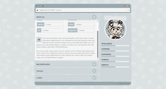
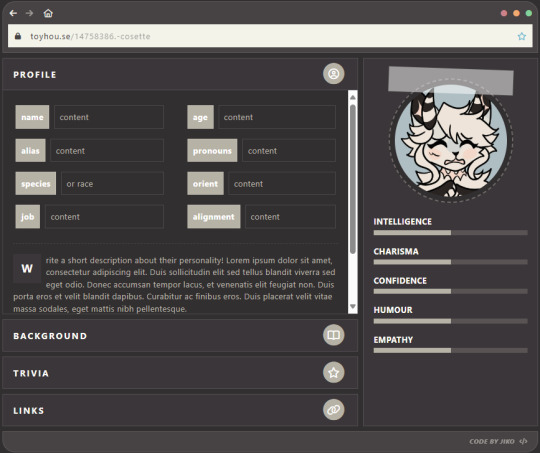
Felted
🧩 Author: jiko 🔗 Code Link: [ P2U ] Felted on Toyhouse 💠 Use Type: Pay to Use (P2U) 📄 Purpose: Character Profile 📝 Description: A clean, user-friendly character profile layout with a modern interface styled like a browser window. Features organized sections for profile stats, a personality description, and expandable tabs for background, trivia, and links. The sidebar includes a character icon and five stat bars (intelligence, charisma, confidence, humor, empathy). Comes in two versions: light custom-colored and dark Bootstrap for wider compatibility and personal aesthetic preference.
📷 Previews:
#toyhou.se code#character profile#p2u#bootstrap code#custom color layout#stat bars#html layout#toyhouse resources#modern profile#charactercodes#jiko
1 note
·
View note
Text
Blank 8.0.0
Blank is now hosted on GitHub and released as an open source project under the MIT license: https://github.com/willwood/Blank-RapidWeaver-Theme
Version 8 of Blank has been published today. Changes in this major update include the following:
Removed support for banners, to improve page loading speed and avoid gaps at the top.
Removed the background colour picker, so it no longer conflicts with certain CSS libraries.
Removed the %sidebar%, %sidebar_title% and %plugin_sidebar%, as these were seldom used.
Disabled automatic theme updates, owing to unreliability and high bandwidth costs.
New attribution and theme details shown in a comment block, at the top of the source code.
Simplified the HTML markup for the content container. We are now only using a tag.
Adds support for picnic.css as a new and alternative CSS library. Updated Bootstrap Icons to version 1.11, giving you over 300 new icon designs.
Adds support for LaTeX.css. A CSS library which makes a page look like a LaTeX document.
To download the latest version from GitHub, simply click the button labelled 'Latest' in the sidebar, under releases. That takes you to a page listing the ZIP package to download on your computer. Unzip and install the theme in the normal way.
0 notes
Text
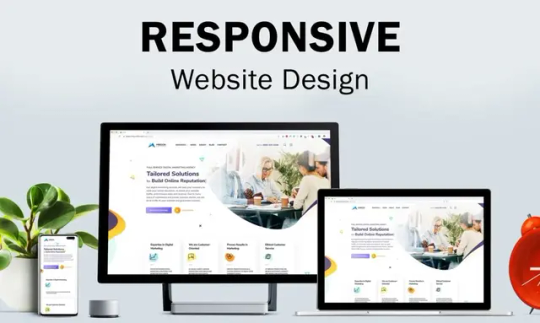
Why is responsive design necessary for your website, and what does it mean?
Numerous devices, such as cell phones, tablets, laptops, and desktop computers, are used to view websites in today's digital environment. This diversity has made responsive design necessary for any website aiming to provide a seamless user experience. In this article, we’ll explore responsive design, how it works, and why it’s essential for modern websites.
What Is Responsive Design?
The information and style of a website are guaranteed to adjust to the screen size and resolution of the device being used through a web design method called responsive design. Creating a uniform and optimum user experience across all devices is the main objective of responsive design.
Key Features of Responsive Design:
Fluid Grids: Make use of adaptable designs that adjust proportionately to various screen sizes. Flexible Images: Images adjust dynamically to avoid being too large or small on any device. Media Queries: CSS rules that enable specific styles based on screen dimensions and device characteristics.
How Does Responsive Design Work?
Responsive design relies on three core principles:
Scalable Layouts: Websites use percentage-based widths rather than fixed measurements like pixels. For example, a sidebar that takes up 25% of the page will scale proportionally as the screen size changes.
Media Queries: Developers can apply different styles depending on the screen size, resolution, or orientation (landscape vs. portrait) of the device by using media queries, which are CSS techniques.
Flexible Content: Content elements like images, videos, and text are designed to resize or reorganize based on the viewport dimensions.
Why Does Your Website Need Responsive Design?
1. Mobile-First Era: Mobile devices currently account for over 60% of all web traffic. A non-responsive website can lead to poor usability, driving visitors away and reducing engagement.
2. Improved User Experience: Responsive design ensures that users have a seamless experience, whether they’re browsing on a smartphone, tablet, or desktop. Scrolling, panning, and zooming are less necessary. 3. SEO Benefits: Google prioritizes mobile-friendly websites in search results. Responsive design helps you comply with Google’s mobile-first indexing, improving your site’s visibility and rankings.
4. Cost Efficiency: It is less expensive to maintain a single responsive website rather than to create and manage separate desktop and mobile versions.
5. Future-Proofing Your Website: With the growing variety of screen sizes and devices, responsive design ensures that your website remains functional and visually appealing across current and future technologies.
6. Higher Conversion Rates: A website that’s easy to navigate and looks great on any device reduces bounce rates and encourages visitors to take desired actions, such as purchasing a product or signing up for a newsletter.
Examples of Responsive Design in Action
Navigation Menus: Collapsible menus or hamburger icons for smaller screens. Dynamic Grids: A grid-based layout that reorganizes elements to fit smaller viewports. Responsive Images: Images resize or crop automatically to maintain quality and relevance.
How to Implement Responsive Design?
Adopt a Mobile-First Approach: Start designing for smaller screens and progressively add features for larger screens. Use a Responsive Framework: Tools like Bootstrap or Foundation simplify the process with pre-built responsive components. Test Across Devices: Use tools like BrowserStack or Google’s Mobile-Friendly Test to ensure your site looks and functions well on various devices.
Conclusion
These days, responsive design is an essential component of contemporary web development. By ensuring your website adapts seamlessly to different devices, you can enhance user satisfaction, boost your SEO rankings, and future-proof your online presence. Investing in responsive design is not just about keeping up with trends; it’s about creating a functional, engaging, and user-friendly website that caters to the needs of your audience.
0 notes
Text
Avas Theme Multi-Purpose Elementor WordPress Theme v6.6.3
https://themesfores.com/product/avas-theme-multi-purpose-elementor-wordpress-theme/ Avas Theme – Multi-Purpose Elementor WordPress Theme Avas theme is a multi-purpose responsive WordPress theme with lightweight and fewer plugins. Ready to use for any purpose such as Business, Finance, Corporate, Agency, Portfolio, App, Real Estate, News, Blog, Magazine, Cleaning services, Construction, Designs, Freelancer, Wedding, Restaurant, Education, Charity, Shop, Mechanic, Moving, Covid-19 Coronavirus, Resume, Startup, Creative, Architecture, Consultant, Kindergarten, Travel, Insurance, Lawyer, Medical, Hosting, Fitness, Gym, Spa, SEO, Pinterest Style, ICO Cryptocurrency, Crypto News, Photographer, Website Builder, Website Solution, Barber Shop, Driving School, Nice & Clean, Music Band, Chef, Tattoo Parlour and many more. Avas has 48 different demos ready with one click demo install supported so you can choose any of the demos according to your niche. Avas templates are built with a super-fast lightweight Elementor page builder with a drag and drop function so your website will not load heavily. We have added lots of options in the theme options panel with the Redux framework so you don’t need any coding knowledge. AVAS GPL Theme Features (Demo) Built with Redux Framework for easy customization and endless options. Built with Twitter Bootstrap. Elementor Page Builder included is the best lightweight page builder that won’t make your page slow. It has many ready-made templates. You can create a nicer page within minutes. SEO optimized for search engine recognizably. 100% responsive, performs beautifully on all devices. Smooth parallax effect. Beautiful portfolio galleries, optimized for desktop, laptop, tablet, and mobile devices. Google Font, Font Awesome, Flaticon, and Icomoon font icon integrated. Fully integrated Contact Form 7 with CSS Style ready. Responsive sticky header with a menu. Left – Right Sidebar blog layouts. Filterable portfolio layouts to choose of three columns grid, four columns grid, and pagination. Translation Ready – You can translate the theme to your own Language. WPML Ready WordPress theme Customizer support. Custom widgets included. One-click demo install. Mega Menu(no plugin required). Side Menu RTL supported Cookie notice bar without plugin Dark Mode support Server Minimum Requirements: PHP version 7.4 or greater. MySQL version 5.6 or greater OR MariaDB version 10.1 or greater. WP Memory: 256 MB or greater PHP max input variables 10000 max_execution_time: 120 (This needs to be increased if your server is slow and cannot import data.) PHP Post Max Size: 64 MB or greater Avas Theme Change Version 6.6.3 – August 20, 2024 – New: Avas Switcher widget created. – Fixed: The Avas Heading widget alignment option is not working on the responsive view. Version 6.6.2 – August 10, 2024 – New: Immigration Visa Consulting demo released. https://tinyurl.com/avas-immigrationvisaconsulting – Tweak: Sticky Section content width added % option to fix the responsive layout issue. – Fixed: PHP Fatal error: Uncaught Error: Undefined constant “TX_CSS”. – Fixed: Tiktok url doesn’t work. – Fixed: get_page_by_title() deprecated. – Integrated: Fontawesome v6.6.0. – Updated: Twitter new icon X. Version 6.6.1 – August 1, 2024 – New: Avas Grid Elementor widget created. – New: Avas Carousel Elemenetor widget created. – Updated: Redux Framework. https://themesfores.com/product/avas-theme-multi-purpose-elementor-wordpress-theme/ #Multi-PurposeThemes #WordpressTheme
0 notes
Text

A Pro Bootstrap Admin Template streamlines documentation creation with its intuitive interface and comprehensive features. With 9 Responsive Web Application Kit, including the main bootstrap admin dashboard for control, visitor stats, and rapid email, it's your ultimate command centre. Choose from boxed, fixed, or collapsed sidebar layouts for flexibility. Integration of titles and tips ensures smooth navigation, while a range of apps, from widgets to weather and calendar, enrich user experience. This template empowers you to create polished documentation sites in record time. Simplify your documentation process today with A Pro Bootstrap Admin.
#Bootstrap Admin Templates#Bootstrap Admin Template#Dashboard Admin Templates#Admin Templates Bootstrap#Premium Admin Template
0 notes
Text
Fasi di Realizzazione di un Tema WordPress con Twig
1. Pianificazione del Progetto
La creazione di un tema WordPress personalizzato inizia con una pianificazione dettagliata. Durante questa fase, si definiscono gli obiettivi del sito web, il pubblico di riferimento, le funzionalità necessarie e il design desiderato. È importante creare una mappa del sito e uno schema delle pagine principali per avere una visione chiara della struttura del sito. Definire le specifiche tecniche, inclusi i plugin necessari e le integrazioni con servizi esterni, è cruciale per un progetto ben riuscito.
2. Configurazione dell'Ambiente di Sviluppo
Il passo successivo consiste nella configurazione dell'ambiente di sviluppo. Si inizia con l'installazione di WordPress su un server locale utilizzando strumenti come XAMPP, MAMP o Local by Flywheel. Successivamente, si installa Timber, un plugin che integra il motore di templating Twig con WordPress. Questo richiede l'installazione di Composer, un gestore di dipendenze per PHP, per scaricare e gestire Timber.
3. Creazione della Struttura del Tema
Con l'ambiente configurato, si procede a creare la struttura del tema. Questo include la creazione della cartella del tema all'interno della directory wp-content/themes. Al suo interno, si creano sottocartelle per CSS, JavaScript, immagini e template. È anche necessario creare file di base come style.css (che contiene le informazioni del tema) e functions.php (che include le funzioni PHP specifiche del tema e registra Timber).
4. Sviluppo dei Template con Twig
Twig permette di creare template puliti e modulari. Si inizia creando il file index.twig che rappresenta il layout principale del sito. Utilizzando le funzionalità di Timber, si crea un collegamento tra i file PHP e i template Twig. Ad esempio, il file index.php caricherà index.twig tramite Timber::render. Twig consente di utilizzare variabili, filtri e funzioni per generare contenuti dinamici, migliorando la leggibilità e la manutenzione del codice.
5. Creazione dei Componenti del Tema
La creazione dei componenti del tema include la definizione di header, footer, sidebar e singoli post. Utilizzando i template Twig, si possono creare parti riutilizzabili del layout. Ad esempio, header.twig e footer.twig verranno inclusi nei template principali per mantenere un layout coerente. Si utilizzano i loop di Twig per iterare sui post e visualizzare i contenuti dinamici.
6. Personalizzazione e Stili
La fase di personalizzazione implica l'aggiunta di CSS e JavaScript per stilizzare e dinamizzare il tema. È possibile utilizzare framework CSS come Bootstrap o Tailwind per accelerare lo sviluppo. Timber permette anche di incorporare facilmente asset esterni e gestire i caricamenti condizionali per ottimizzare le performance del sito.
7. Testing e Debugging
Prima del lancio, è essenziale testare il tema su diverse piattaforme e dispositivi. Si verifica la compatibilità cross-browser e si eseguono test di performance per assicurarsi che il sito sia veloce e reattivo. Utilizzare strumenti di debug come WP_DEBUG e le funzioni di log di Timber aiuta a individuare e risolvere eventuali problemi.
8. Deploy e Manutenzione
L'ultima fase è il deploy del tema su un server di produzione. Questo include la configurazione del server, il caricamento dei file del tema e l'aggiornamento delle configurazioni di WordPress. Una volta online, è importante monitorare il sito, aggiornare regolarmente il tema e i plugin, e ottimizzare le performance per mantenere il sito sicuro ed efficiente.
L'utilizzo di Twig con WordPress, grazie alla flessibilità e alla potenza di Timber, rende lo sviluppo di temi più organizzato e manutenibile, permettendo di creare temi personalizzati e ottimizzati con maggiore facilità.
Per una consulenza visita il mio sito e compila il modulo. Sarò felice di aiutarti nella realizzazione del tuo progetto.
1 note
·
View note
Text
15+ Shopping Cart Template HTML and CSS(Free Demo+Code)
Shopping Cart Template HTML and CSS
Hello Coder! Welcome to Codewithrandom with a new blog. Today We will share the Top 15 Shopping Cart Templates using HTML and CSS.
What is a shopping cart HTML template?
A shopping cart is an essential part of any E-commerce or retailer’s website or online platform store, which provides all its services under one roof right from browsing products to placing orders to the payment gateway.
Shopping Carts are used by clients/customer to shortlist their favorite products and lead them or proceed with them.
Related Article – 50+ HTML, CSS, and JavaScript Projects With Source Code
15+ Awesome Bootstrap Sidebar Menu Templates
Here today we will learn to design our own Bootstrap Shopping Cart UI comprising of a payment button along with items shortlisted displayed efficiently.
Training for web developers and IT Trainees to create a dynamic shopping cart interface.
Happy exploring and learning!
Below are the Shopping Cart Template HTML CSS example collections with Free Source code.
1. Bootstrap 4 shopping bag checkout with the order summary
Here You Can See How The Above Bootstrap Shopping Cart Project Depicts The Bootstrap 4 shopping bag checkout with the order summary Implemented Using HTML And CSS.
In The Above-Displayed Bootstrap Shopping Cart Project, We Have For you a Bootstrap 4 e-commerce shopping cart with item summary Using HTML, And CSS.
3. Bootstrap 4 e-commerce shopping cart with plus minus icons
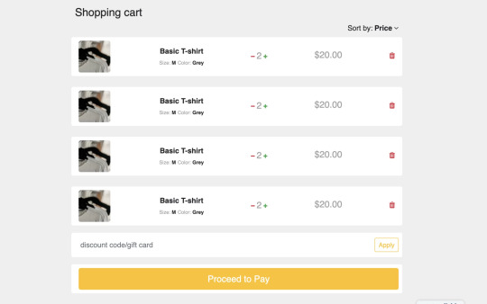
Here You Can See How The Above Bootstrap Shopping Cart Project Depicts a Bootstrap 4 e-commerce shopping cart with plus-minus icons Implemented Using HTML And CSS.
Read also: 100+ JavaScript Projects With Source Code ( Beginners to Advanced)
read complete article and get full source code freely
0 notes
Text
T3 React Bootstrap - Headless TYPO3 Template

T3 ReactBootstrap is a Headless TYPO3 Template that comes up with a sleek and modern design suitable for a variety of TYPO3 website types.T3 ReactBootstrap TYPO3 theme is developed based on the industry's most widely used Bootstrap CSS framework. Moreover, T3 ReactBootstrap comes with almost all the most powerful elements you need to build a perfect website.
Designed using React & Nextjs Prioritising Contemporary visuals and Fast loading Times of 2 Seconds!
TYPO3 V12 Compatible
T3 React Bootstrap is fully compatible with TYPO3 V12, ensuring seamless integration and enhanced performance. Gearing up your TYPO3 experience with the latest version of T3 React Bootstrap.
Layout Variations
T3 ReactBootstrap Layout Variations offers a wide range of layout variations, including full-width, boxed, and sidebar layouts, allowing developers to choose the best layout for their content and design needs.
Multilingual At Heart
With its comprehensive multilingual support and customization options, Multilingual At Heart provides a powerful solution for developers seeking to create multilingual websites with ease.
Light Weight & SEO Friendly
The template, named T3 React Bootstrap, is developed using Next.js and React.js technologies, ensuring super-fast loading speeds and SEO-friendly performance.
T3 ReactBootstrap stands out as a cutting-edge Headless TYPO3 Template with a sleek and modern design, tailored for diverse TYPO3 websites. Leveraging the power of Bootstrap CSS, it offers a feature-rich experience with contemporary visuals and rapid loading times of just 2 seconds. Its compatibility with TYPO3 V12 ensures seamless integration and heightened performance, elevating the TYPO3 experience. With versatile layout variations and a focus on multilingual capabilities, T3 ReactBootstrap provides developers with a dynamic and customizable solution. Notably, its lightweight structure and SEO-friendly design, developed using Next.js and React.js, contribute to exceptional speed and performance, making it an ideal choice for crafting high-quality websites.
0 notes
Text
Responsive Sidebar Navigation For Bootstrap 5
Responsive Sidebar Navigation For Bootstrap 5
An extension to Bootstrap 5 that lets you create a responsive sidebar navigation (also called drawer navigation, off-canvas menu) on your next Bootstrap project. How to use it: 1. Create the HTML for the sidebar navigation. <div class="side-navbar active-nav d-flex justify-content-between flex-wrap flex-column" id="sidebar"> <ul class="nav flex-column text-white w-100"> <a href="#"…
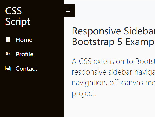
View On WordPress
2 notes
·
View notes
Text
Electro v3.5.1 – Electronics Store WooCommerce Theme
https://themesfores.com/product/electro-electronics-store-woocommerce-theme/ Electro Electronics Store WooCommerce Theme is a robust and flexible WordPress theme, designed by Transvelo to help you make the most out of using WooCommerce to power your online store. The design is well suited for Electronics Store, Vendor based marketplaces, affiliate websites. It is built and comes bundled with most of the advanced features available in most popular eCommerce websites like Amazon, Flipkart, Snapdeal, Walmart, Alibaba, Aliexpress, etc. The theme is built on top of the Underscores framework. The code is lean and extensible. This will allow developers to easily add functionality to your side via child theme and/or custom plugin(s). It features deep integration with WooCommerce core plus several of the most popular extensions: Visual Composer; Slider Revolution; YITH WooCommerce Wishlist; YITH WooCompare. Electro Electronics Store WooCommerce Theme Features easy Installation and Setup; Free Updates and one-to-one support; Comes with importable dummy data; Built on Bootstrap 4; Cross-browser compatible (Chrome/Firefox/IE); Built with SASS – All SASS files included; 4 Pre-defined header styles and option to customize headers; 9 Pre-defined color scheme and option to generate custom colors; 3 Different types of home pages; Responsive Megamenu; 9 Pre-built Pages; Supports various post formats and post thumbnails feature; Includes 17 widgets; WPML Compatible; Youtube like page loader. WOOCOMMERCE FEATURES Advanced Products Live Search; 3 Different layouts for Single Product Pages; Advanced Reviews; Advanced Specifications tab; Accessories for Products like in amazon; Catalog Mode available; Shop Page Jumbotron; Wishlist and Compare from YITH; Brands Carousel; Products Carousel; Ability to display products in 2, 3, 4, 5 and 6 columns; Custom Product Comparison page. BLOG OPTIONS 3 Different types of layout: Classic, ListView, Grid View; Choose from Right Sidebar, Left Sidebar or Full-width layouts; Enable placeholder images. OTHER CUSTOMIZATION OPTIONS Integrated with Google Fonts; Can choose from FontAwesome icons; Integrated with Social Media; Can paste custom CSS easily; Import/Export customization options. Electro Electronics Store WooCommerce Theme Please note that any digital products presented on this website do not contain malicious code, viruses or advertising. For License Key:- themesfores.com products are functional without entering a product license code. We are unable to provide a license code for you, and it’s because we already obtain the Plugin/Theme to the original developer. The use of a license code usually is for automatic updates and premium support from the original developer. Besides, we guarantee you to deliver a free manual update and minor assistance for your convenience of using the product. https://themesfores.com/product/electro-electronics-store-woocommerce-theme/ #WooCommerceTheme #WordpressTheme
0 notes
Text
How to Create a Responsive Sidebar in React Using Bootstrap
Most of the websites are using sidebars nowadays. Sidebars are the website component shown to the left or right side of the website. They are used to display secondary information, navigation of websites, social media links and advertisements. This article is for you if you are entering in website development and want to create a website sidebar.
What Is React?
React is a free and open-source JavaScript library used to build the user interface, like using it for making a sidebar. Facebook developed it and released it in May 2013. React is a web platform, and it uses JavaScript.
Directly creating a sidebar from React will take more time but react has a JavaScript library called ‘’react-bootstrap’’. It has lots of components and styles that we will use to create a responsive sidebar.
What is ‘’react-bootstrap’’?
React-bootstrap is a bootstrap JavaScript made from scratch by React. React-bootstrap eliminates any dependency like jQuery. For years, it gradually became popular in making the UI foundation of any website. ‘’react-bootstrap’’ works with lots of bootstrap themes, making navbars, cards, layouts, and its React component model provides more control.
Before you start, you should know the following:
Basic Knowledge of React
NPM installed
Basic bootstrap Knowledge
NodeJS installed
Firstly, check that you have a node installed or not. You can check it by using this command: ‘’node -v. ‘’ If the Node is not installed, you can download it and install it. If you install Node, NPM also comes with it. You can check the NPM version by this command: ‘’npm –version’’.
Now, we have Node installed, and we can start to make a directory named ‘’sidebar’’ by using this command: ‘’npx create-react-app sidebar-app’’. You can use any name in place of the sidebar.
Installing Cdbreact
Now, we are installing CDBreact. CDBreact is a UI kit, and it has reusable components. It used to create websites and web apps.
To install CDBreact, enter the following command: ‘’npm install --save cdbreact’’.
Installing React router
We are installing react-router because a component of react-router, Navlink, will be needed for the sidebars.
Enter the following command to install react-router: ‘’npm install react-router-dom’’.
Now, you can check for any errors by running the command ‘’npm start’’.
‘’BrowserRouter’’ components will not work outside of react-router-dom to fold the app with ‘’BrowserRouter’’.
Creating a Sidebar
Now, we will create a file sidebar.js which will have a sidebar component. Now you have to import various sidebar components from cdbreact like CDBSidebarContent, CDBSidebarFooter, CDBSidebarHeader, CDBSidebarMenu, and CDBSidebarMenuItem.
We also have to import Navlink from React-router.
Now, let's make a sidebar header and footer, we will also add styles to components to look good.
Now, enter the text color, background color, padding pixels value according to your needs.
To add the body on the sidebar, enter the following in your code. Under CDBSidebarHeader you have to enter the following:

Now, let us import the sidebar into the app component.

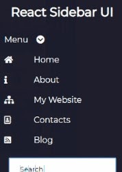
Now, the sidebar is ready. You can see that your sidebar will have a dashboard, tables, profile page, analytics and 404 pages Or you can add home, about, my website, contacts, and blog. You can add anything you want, like You can put social media, advertisements, the live feed of content or any other content you want.
Conclusion
Creating sidebars on websites in react is simple with using react-bootstrap. You will not need jQuery. Before you start making sidebars, you must know React and bootstrap, NPM, and NodeJS installed. If you are still confused about adding a responsive sidebar or want to make a complete-featured website for your business, you can contact latitude technolabs; we have experts ready to help you.
0 notes